
Trong bài viết này, chúng ta sẽ tìm hiểu về hiệu ứng hoạt hình trên đồng hồ sử dụng CSS, cụ thể là CSS Watch Animation. CSS Watch Animation là một kỹ thuật cho phép tạo ra các hiệu ứng hoạt hình trên các thành phần HTML, ví dụ như đồng hồ, đồng hồ báo thức vv. bằng cách sử dụng CSS.
Lập Trình Viên mời bạn cùng tham khảo chi tiết nội dung bên dưới. Bài viết này nằm trong chuyên đề hướng dẫn CSS từ cơ bản đến nâng cao tại dự án Phát Triển Website.
Tổng quan CSS Watch Animation
CSS Watch Animation là một trong những kỹ thuật được sử dụng để tạo ra hiệu ứng hoạt hình trên các thành phần HTML. Nó cho phép bạn tạo ra các hiệu ứng hoạt hình trên các đồng hồ số hoặc đồng hồ kim. Thêm vào đó, nó cũng cho phép bạn tạo ra các hiệu ứng hoạt hình khác trên các thành phần HTML khác. Kỹ thuật này rất hữu ích cho các trang web liên quan đến đồng hồ và thời gian.
CSS Watch Animation là phương pháp tạo ra hiệu ứng hoạt hình trên các thành phần HTML như đồng hồ, đồng hồ báo thức vv. bằng cách sử dụng CSS. Kỹ thuật này cho phép bạn tạo ra các hiệu ứng hoạt hình khác nhau trên các thành phần HTML.
Hướng dẫn CSS Watch Animation
Để tạo ra hiệu ứng CSS Watch Animation, bạn có thể sử dụng một số thuộc tính CSS như animation-name, animation-duration, animation-delay, animation-iteration-count và animation-timing-function. Dưới đây là ví dụ về cách áp dụng thuộc tính animation-name để tạo ra một hiệu ứng hoạt hình trên đồng hồ số:
<div class="watch">
  <div class="face">
    <div class="hour-hand"></div>
    <div class="minute-hand"></div>
    <div class="second-hand"></div>
  </div>
</div>

<style>
  .watch {
    width: 100px;
    height: 100px;
    border: 1px solid black;
    background: white;
  }

  .face {
    width: 100%;
    height: 100%;
  }

  .hour-hand {
    width: 10px;
    height: 30px;
    border-top-left-radius: 50%;
    border-bottom-left-radius: 50%;
    background: black;
    transform-origin: center;
    animation: hour-hand 12h linear infinite;
  }

  .minute-hand {
    width: 5px;
    height: 50px;
    border-top-left-radius: 50%;
    border-bottom-left-radius: 50%;
    background: black;
    transform-origin: center;
    animation: minute-hand 60m linear infinite;
  }

  .second-hand {
    width: 2px;
    height: 100px;
    border-top-left-radius: 50%;
    border-bottom-left-radius: 50%;
    background: black;
    transform-origin: center;
    animation: second-hand 60s linear infinite;
  }

  @keyframes hour-hand {
    0% {
      transform: rotate(0deg);
    }
    360% {
      transform: rotate(360deg);
    }
  }

  @keyframes minute-hand {
    0% {
      transform: rotate(0deg);
    }
    360% {
      transform: rotate(360deg);
    }
  }

  @keyframes second-hand {
    0% {
      transform: rotate(0deg);
    }
    360% {
      transform: rotate(360deg);
    }
  }
</style>
Trong ví dụ này, ba hình chữ nhật được sử dụng để đại diện cho kim đồng hồ. Kim giờ có chiều dài lớn nhất, kim phút có chiều dài trung bình và kim giây có chiều dài ngắn nhất.
Các thuộc tính CSS được sử dụng để tạo hiệu ứng quay kim đồng hồ bao gồm:
transform: Định nghĩa cách các phần tử được định vị và xoay.animation: Định nghĩa các animation để xoay kim đồng hồ.
Kim giờ được định vị ở trung tâm của mặt đồng hồ và được xoay 360 độ trong 12 giờ. Động tác xoay được lặp lại vô hạn.
Kim phút được định vị ở trung tâm của mặt đồng hồ và được xoay 360 độ trong 60 phút. Động tác xoay được lặp lại vô hạn.
Kim giây được định vị ở trung tâm của mặt đồng hồ và được xoay 360 độ trong 60 giây. Động tác xoay được lặp lại vô hạn.
Bạn có thể điều chỉnh các thuộc tính CSS để tạo hiệu ứng quay kim đồng hồ theo sở thích của mình. Ví dụ: bạn có thể thay đổi tốc độ quay của kim đồng hồ bằng cách thay đổi giá trị của duration. Bạn cũng có thể thay đổi màu sắc và kích thước của kim đồng hồ.
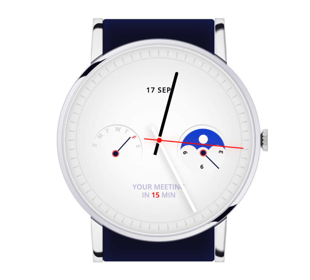
Thêm ví dụ hiệu ứng đồng hồ
Code HTML:
<div class="wrapper">
  <div class="watch-strap">
    <div class="strap-circle"></div>
    <div class="strap"></div>
    <div class="watch-strap-holder left-up"></div>
    <div class="watch-strap-holder left-bottom"></div>
    <div class="watch-strap-holder right-up"></div>
    <div class="watch-strap-holder right-bottom"></div>
    <div class="watch-lace">
      <div></div>
      <div></div>
      <div></div>
      <div></div>
      <div></div>
      <div></div>
      <div></div>
      <span class="top"></span>
      <span class="bottom"></span>
    </div>
  </div>
  <div class="watch-case">
    <div class="reflection"></div>
    <div class="reflection bottom"></div>
    <div class="watch-center">
      <div class="watch-points"><i></i><i></i><i></i><i></i><i></i><i></i><i></i><i></i><i></i><i></i><i></i><i></i><i></i><i></i><i></i><i></i><i></i><i></i><i></i><i></i><i></i><i></i><i></i><i></i><i></i><i></i><i></i><i></i><i></i><i></i><i></i><i></i><i></i><i></i><i></i><i></i><i></i><i></i><i></i><i></i><i></i><i></i><i></i><i></i><i></i><i></i><i></i><i></i><i></i><i></i><i></i><i></i><i></i><i></i><i></i><i></i><i></i><i></i><i></i><i></i></div>
      <div class="watch-tips">
        <span class="hours"></span>
        <span class="minutes"></span>
        <span class="seconds"></span>
      </div>
      <div class="watch-date">17 SEP</div>
      <div class="watch-alert">Your meeting <br>in <strong>15</strong> min</div>
      <div class="watch-week">
        <span class="week-arrow"></span>
        <ul>
          <div>S</div>
          <div>M</div>
          <div>T</div>
          <div>W</div>
          <div>T</div>
          <div>F</div>
          <div>S</div>
        </ul>
      </div>
       <div class="watch-day">
         <div class="sun">
           <div></div>
           <div></div>
           <div></div>
           <div></div>
           <div></div>
           <div></div>
           <div></div>
           <div></div>
           <div></div>
         </div>

      </div>
      <div class="watch-week days">
        <span class="week-arrow"></span>
        <ul>
          <div>3</div>
          <div>6</div>
          <div>9</div>
        </ul>
      </div>
    </div>
  </div>
</div>
Code CSS:
@import url('https://fonts.googleapis.com/css?family=Open+Sans:400,600,700');
body
  background-color #fff
  min-height 100vh
  display flex
  align-items center
  justify-content center
  font-family: 'Open Sans', sans-serif;

.wrapper
  position relative

.watch
  &-case
    position absolute
    z-index 4
    top 50%
    left 50%
    transform translate(-50%, -50%)
    height 400px
    width 400px
    overflow hidden
    background-image linear-gradient(-45deg, #fdfdfd, #ceced6, #fdfdfd)
    border-radius 50%
    box-shadow:
      0 0 1px 2px rgba(#b4b1c1,.7)

  &-center
    background-image radial-gradient(#ffffff,#eeeeef)
    height 380px
    width 380px
    border-radius 50%
    position absolute
    z-index 4
    left 50%
    top 50%
    transform translate(-50%, -50%)
    box-shadow:
      -1px -1px 1px 0 #fdfdfd,
      0 0 0 2px #b8b7c3,
      inset 0 0 0 2px #d1d1d6,
      inset 0 0 0 4px rgba(#fff,.7),
      inset 0 0 8px 8px rgba(#000,.1),
      inset 0 0 50px 50px rgba(#000,0.05)
  &-strap
    position absolute
    top 50%
    left 50%
    transform translate(-50%, -50%)
    height 480px
    width 220px
    background-color #101022
    border-radius 6px
    z-index 2

    .strap-circle
      position absolute
      height 409px
      width 409px
      background-color transparent
      top 50%
      left 50%
      transform translate(-50%, -50%)
      border-radius 50%
      box-shadow:
        inset -1px 0 8px 3px #151427,
        0 0 2px 1px rgba(#fff,.8)
      &:after
        content ""
        display block
        height 100%
        width 72px
        left -2px
        position absolute
        background-color #fff
      &:before
        content ""
        display block
        height 100%
        width 72px
        background-color #fff
        position absolute
        right -2px
    .strap
      position absolute
      top 50%
      left 50%
      transform translate(-50%, -50%)
      height 480px
      width 220px
      background-color #101022
      border-radius 6px
      z-index 2
      box-shadow:
        -1px 0 1px 0 #000,
        inset 0 20px 40px -20px rgba(#172365,1),
        inset 0 -20px 40px -20px rgba(#172365,.7)
    &-holder
      position absolute
      background-color #e7e7ea
      height 150px
      width 20px
      left -20px
      border-radius 3px
      top -2px
      z-index -1
      box-shadow:
        inset 0 0 4px 1px rgba(#000,0.2)
      &.left-bottom
        transform scaleY(-1)
        top 332px
        left -20px
      &.right-up
        transform scaleX(-1)
        left 220px
        box-shadow:
          inset 0 0 4px 1px rgba(#000,0.2)

        &:after
          border-radius 14px 70px 0 0
          box-shadow:
           inset 0px 3px 1px -2px rgba(#fff,.6),
           inset -10px -15px 1px 2px rgba(#dcdce4,1),
           inset -2px 10px 4px 2px rgba(#181820,1)
      &.right-bottom
        transform scaleY(-1) scaleX(-1)
        top 332px
        left 220px
        &:after
          border-radius 14px 70px 0 0
          box-shadow:
           inset 0px 3px 1px -2px rgba(#fff,.6),
           inset -10px -15px 1px 2px rgba(#dcdce4,1),
           inset -2px 10px 4px 2px rgba(#181820,1)
      &:before
        content ""
        display block
        position absolute
        background-color #e7e7ea
        height 150px
        width 10px
        border-radius 3px 0
        transform rotate(4deg)
        left -5px
        box-shadow:
          inset 5px 5px 4px -5px rgba(#000,0.2)
       &:after
         content ""
         display block
         position absolute
         background-color transparent
         background-image linear-gradient(to bottom, transparent, #fff)
         height 150px
         width 30px
         border-radius 12px
         transform rotate(4deg)
         top 10px
         left -4px
         box-shadow:
           inset -3px 8px 2px 2px rgba(#181820,1)

.reflection
  content ""
  display block
  height 16px
  width 30px
  position absolute
  top 50px
  left 50px
  background-color #080817
  filter blur(1px)
  transform rotate(-56deg) skewX(30deg) scale(.6)
  &.bottom
    top 337px
    left 312px
    &:after
      height 39px
      width 43px
      left -60px
      top -14px
      transform rotate(-44deg)
      box-shadow:
        34px 17px 0 8px #080817
  &:after
    content ""
    display block
    background-color transparent
    height 40px
    width 30px
    border-radius 50%
    background-color transparent
    position absolute
    left -48px
    top -11px
    transform rotate(-69deg)
    box-shadow:
      34px 17px 0 20px #080817
  &:before
    content ""
    display block
    background-color transparent
    height 40px
    width 30px
    border-radius 50%
    background-color transparent
    position absolute
    right 25px
    top 32px
    transform rotate(-69deg)
    box-shadow:
      34px 17px 0 10px #080817,
      14px 32px 0 20px #080817

.watch-points
  position absolute
  z-index 5
  top calc(50% - 6px)
  left calc(50% - 1px)
  transform translate(-50%, -50%)
  &:after
    content ""
    display block
    height 325px
    width 325px
    position absolute
    border 2px solid #dededf
    top calc(50% + 6px)
    left calc(50% + 1px)
    transform translate(-50%, -50%)
    border-radius 50%
  i
    display block
    height 12px
    width 2px
    background-image linear-gradient(to bottom, #c6c6cb,  #e0e0e1)
    position absolute

i
  for num in (1..60)
    &:nth-child({num})
      transform rotate((num*360/60-6)deg) translate(0, -172px)


.watch-week
  position absolute
  top calc(50% - 6px)
  left calc(50% - 6px)
  transform translate(-120px, 40px) rotate(-70deg)
  z-index 10
  &.days
    transform translate(50px, 40px) rotate(-70deg)
    &:after
      transform rotate(256deg)
    ul
      transform rotate(169deg) translate(-58px, -17px)
    div
      color #1F1F21
      &:nth-child(1)
        transform rotate(0) translate(0, -37px) scaleX(-1)
      &:nth-child(2)
        transform rotate(80deg) translate(0, -37px) scaleX(-1) scaleY(-1)

      &:nth-child(3)
        transform rotate(160deg) translate(0, -37px)
    .week-arrow
      transform rotate(115deg) translate(35px,-8px)
  &:after
    content ""
    display block
    height 100px
    width 100px
    border-radius 50%
    background-color transparent
    transform rotate(-64deg)
    box-shadow 1px 2px 0 0px #d6d6d3
    position absolute
    left -2px
    top -28px
  .week-arrow
    position absolute
    top 50%
    left 50%
    transform translate(19px, 21px) rotate(22deg)
    width 45px
    height 2px
    background-color #0f1743
    z-index 5
    &:after, &:before
      content ""
      position absolute
      display block
      height 14px
      width 14px
      background-color #ff5456
      border-radius 50%
      left -6px
      top -6px
      z-index -1
    &:after
      background-color #0f1743
      height 10px
      width 10px
      top -4px
      left -4px
      z-index -1
  div
    font-weight bold
    font-size 11px
    position absolute
    z-index 10
    height 12px
    width 12px
    display block
    color #d6d6d3
    &:nth-child(1)
      transform rotate(0) translate(0, -45px)
    &:nth-child(2)
      transform rotate(25deg) translate(0, -45px)
    &:nth-child(3)
      transform rotate(50deg) translate(0, -45px)
    &:nth-child(4)
      transform rotate(75deg) translate(0, -45px)
    &:nth-child(5)
      transform rotate(100deg) translate(0, -45px)
    &:nth-child(6)
      transform rotate(125deg) translate(0 ,-45px)
      color #ff5456
    &:nth-child(7)
      transform rotate(150deg) translate(0 ,-45px)


.watch-date
  position absolute
  top calc(50% - 100px)
  left 50%
  font-size 14px
  font-weight 600
  letter-spacing 1px
  transform translate(-50%, -50%)
.watch-alert
  position absolute
  top calc(50% + 100px)
  text-transform uppercase
  text-align center
  left 50%
  font-size 14px
  color #BFBCD8
  font-weight 600
  transform translate(-50%, -50%)
  strong
    color #FF0000
    font-weight 600

.watch-tips
  height 300px
  width 300px
  position absolute
  top 50%
  left 50%
  transform translate(-50%, -50%) rotate(-90deg)
  z-index 11

.hours
  width 190px
  height 6px
  position absolute
  top calc(50% - 3px)
  left calc(50% - 30px)
  transform rotate(153deg)
  background-color #fff
  transform-origin 30px center
  box-shadow 0 4px 12px 2px rgba(#000,0.15)
  border-radius 0 20px 20px 0
  z-index 12
  &:after
    content ""
    display block
    position absolute
    left 23px
    top -5px
    height 14px
    width 14px
    background-color #fff
    border-radius 50%
.seconds
  width 197px
  height 2px
  position absolute
  top 50%
  left calc(50% - 30px)
  transform rotate(0deg)
  animation 10s seconds linear infinite
  background-color #FE0806
  transform-origin 30px center
  box-shadow 0 0 16px 2px rgba(#FE0806,0.2)
  border-radius 0 20px 20px 0
  z-index 15
  &:after
    content ""
    display block
    position absolute
    left 25px
    top -4px
    height 10px
    width 10px
    background-color #FE0806
    border-radius 50%
    z-index 15
.minutes
  width 170px
  height 6px
  position absolute
  top calc(50% - 3px)
  left calc(50% - 30px)
  transform rotate(15deg)
  background-color #000004
  transform-origin 30px center
  border-radius 0 20px 20px 0
  z-index 11

@keyframes seconds
  0%
    transform rotate(0deg)
  100%
    transform rotate(360deg)

.watch-lace
  width 0
  height 20px
  border-bottom 10px solid transparent
  border-top 10px solid transparent
  border-right 8px solid #32322A
  position absolute
  right -98px
  top calc(50% - 20px)
  border-radius 6px
  z-index 30
  transform scaleX(.9) scaleY(1.1)
  &:after
    content ""
    display block
    height 40px
    width 10px
    right -16px
    top -10px
    background-color #DEDEDE0
    border-radius 3px
    position absolute
  &:before
    content ""
    display block
    height 40px
    width 4px
    background-color #C3C4CB
    background-image linear-gradient(to left, transparent, rgba(#000,0.1))
    z-index 20
    position absolute
    right -17px
    border-radius 4px
    top -10px
  span
    display block
    position absolute
    background-image linear-gradient(to left, #EAE9E9, transparent)
    height 4px
    width 20px
    top -4px
    left -10px
    transform rotate(-45deg)
    box-shadow
      0 2px 2px 0 rgba(#fff,0.2)
    &.bottom
      top 18px
      transform rotate(45deg)
      background-image linear-gradient(to left, #EAE9E9, transparent)
      opacity .7

  div
    height 2px
    width 7px
    background-color #C4C4C4
    border 1px solid #999891
    position relative
    right -7px
    z-index 20
    top 7px
    &:nth-child(2)
      top -4px
    &:nth-child(3)
      top 6px

    &:nth-child(4)
      top -17px
      filter brightness(110%)
    &:nth-child(5)
      top 4px
      filter brightness(110%)
    &:nth-child(6)
      top -28px
      transform rotate(-4deg)
      filter brightness(115%)
      &:before
        transform rotate(-8deg)
    &:nth-child(7)
      top -1px
      transform rotate(4deg)
      filter brightness(115%)
      &:after
        transform rotate(8deg)
    &:after, &:before
      content ""
      position relative
      background-color #B8B8BB
      height 3px
      width 10px
      display block
      top 0px
      left -3px
      border-radius 3px
    &:before
      top -3px

.watch-day
  height 90px
  width 90px
  display block
  position absolute
  top 50%
  left 50%
  transform translate(42px, -23px)
  background-color #1341D1
  animation 8s day-bg infinite
  border-radius 50%
  overflow hidden
  box-shadow:
    inset 0 -1px 1px 1px #F6F6F6
  background-image:
    radial-gradient(#F6F6F6 18px, transparent 19px),
    radial-gradient(#F6F6F6 14px, transparent 15px),
    radial-gradient(#F6F6F6 18px, transparent 19px),
    radial-gradient(#F6F6F6 60px, transparent 61px)
  background-repeat no-repeat
  background-position:
    -28px 6px,
    0 6px,
    28px 6px,
    0 42px

.sun
  height 10px
  width 10px
  background-color transparent
  position absolute
  border 3px solid #fff
  border-radius 50%
  left calc(50% - 8px)
  top 12px
  animation 8s sun infinite
  &:after
    content ""
    display block
    position absolute
    height 20px
    width 20px
    background-color #212045
    border-radius 50%
    top calc(50% - 10px)
    left calc(50% - 10px)
    animation 8s moon infinite
  div
    position absolute
    height 7px
    width 1px
    background-color #fff
    top calc(50% - 7px/2)
    left calc(50% - 1px)
    border-radius 10px
    animation 8s sun-arms infinite
    &:after, &:before
      content ""
      display block
      height 7px
      width 2px
      background-color #fff
      position absolute
      left 1px
      border-radius 4px
      transform rotate(-10deg)
    &:before
      transform rotate(10deg)
      left -1px
    &:nth-child(1)
      transform rotate(0) translate(0, -9px)
    &:nth-child(2)
      transform rotate(45deg) translate(0, -9px)
    &:nth-child(3)
      transform rotate(90deg) translate(0, -9px)
    &:nth-child(4)
      transform rotate(135deg) translate(0, -9px)
    &:nth-child(5)
      transform rotate(180deg) translate(0, -9px)
    &:nth-child(6)
      transform rotate(225deg) translate(0, -9px)
    &:nth-child(7)
      transform rotate(270deg) translate(0, -9px)
    &:nth-child(8)
      transform rotate(315deg) translate(0, -9px)
    &:nth-child(9)
      transform rotate(360deg) translate(0, -9px)

@keyframes sun
  0%, 33%
    transform rotate(0)
    height 12px
    width 12px
  33%
    background-color #fff
    transform rotate(180deg)
    height 12px
    width 12px
  66%
    transform rotate(180deg)
    background-color #fff
    height 12px
    width 12px
  100%
    background-color transparent
    transform rotate(360deg)
    height 10px
    width 10px

@keyframes sun-arms
  0%
    opacity 1
  20%, 55%
    opacity 0
  100%
    opacity 1

@keyframes moon
  0%
    transform translate(-14px, 14px)
    opacity 0
  25%
    transform translate(-14px, 14px)
    opacity 1
  45%
    transform translate(0px, 0px)
    opacity 1
  50%
    transform translate(14px, -14px)
    opacity 0
  50%
    opacity 0
  100%
    transform translate(0, 0)
    opacity 0

@keyframes day-bg
  0%
    background-color #2b7edc
  8%,50%
    background-color #212045
  60%
    background-color #1341D1
  100%
    background-color #2b7edc
Kết Quả:
Ưu và Nhược điểm CSS Watch Animation
Ưu điểm của CSS Watch Animation là nó giúp tạo ra các hiệu ứng hoạt hình mượt mà và hấp dẫn trên các thành phần HTML như đồng hồ, đồng hồ báo thức vv. Nó cũng giúp tăng tính tương tác của trang web và thu hút người dùng. Tuy nhiên, một nhược điểm của kỹ thuật này là nó có thể tốn nhiều thời gian để phát triển và bảo trì.
Lời khuyên CSS Watch Animation
Để tạo ra hiệu ứng hoạt hình CSS Watch Animation, bạn cần phải biết cách sử dụng các thuộc tính CSS như animation-name, animation-duration, animation-delay, animation-iteration-count và animation-timing-function. Ngoài ra, hãy đảm bảo rằng bạn chỉ sử dụng các hiệu ứng hoạt hình khi cần thiết và không lạm dụng chúng, vì điều này có thể ảnh hưởng đến tốc độ tải trang web.
CSS Watch Animation là gì?
CSS Watch Animation là một kỹ thuật cho phép tạo ra các hiệu ứng hoạt hình trên các thành phần HTML như đồng hồ, đồng hồ báo thức vv. bằng cách sử dụng CSS.
CSS Watch Animation có gì đặc biệt?
CSS Watch Animation cho phép tạo ra các hiệu ứng hoạt hình mượt mà và hấp dẫn trên các thành phần HTML như đồng hồ.
Các thuộc tính nào được sử dụng để tạo ra hiệu ứng hoạt hình trên CSS Watch Animation?
Một số thuộc tính CSS được sử dụng để tạo ra hiệu ứng hoạt hình trên CSS Watch Animation bao gồm animation-name, animation-duration, animation-delay, animation-iteration-count và animation-timing-function.
Nhược điểm của CSS Watch Animation là gì?
Một nhược điểm của CSS Watch Animation là nó có thể tốn nhiều thời gian để phát triển và bảo trì.
Lời khuyên nào cho việc sử dụng CSS Watch Animation?
Để sử dụng CSS Watch Animation hiệu quả, bạn cần phải biết cách sử dụng các thuộc tính CSS liên quan.